 New 2025
Melbourne United
When the Melbourne Tigers rebranded as Malbourne United a decade it wasn't the most popular decision. Honestly I still don't entirely understand it given that the Tigers were an iconic part of the NBL for so long.
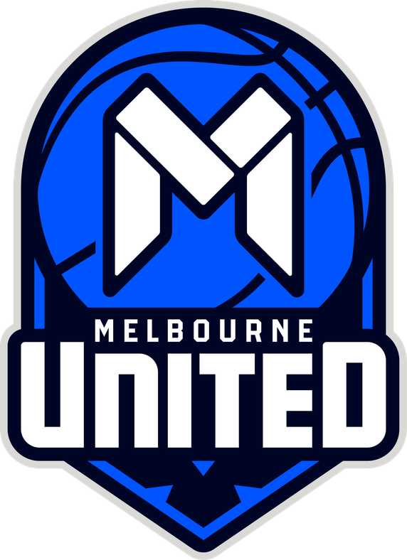
The new logo is a little more grown up, they've refined the "M" icon, fully introduced the brighter cobalt blue what they'd already been using in brand elements and jerseys for a few years, and dialled up the prominence of the "United" name (I never liked how it was abbreviated as "Utd." on the original logo).
They've also included a representation of Bunjil (a wedge-tailed eagle, pays respect to First Nations peoples, particularly the Wurundjeri Woi-wurrung people) at the bottom of the new logo (and also a version as a standalone secondary logo), which to be honest you're probably going to miss unless you read their marketing material on the brand refresh.